Okay, here it goes.--- Note: These are just visual appearances I drew up quickly. Just realized pictures were sideways, sorry.
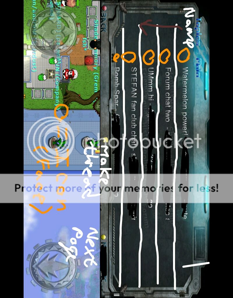
Here I just basically edited the overall look to give it a better appearance. Instead of just font, I put the player's Icon face to the left (furthest left is their name in smaller font) and removed the name that usually gets cut off. I also added a "Next Page" button, which takes you to threads that are farther back (10 threads per page). Also, I added a New Topic Button instead of the previous one.
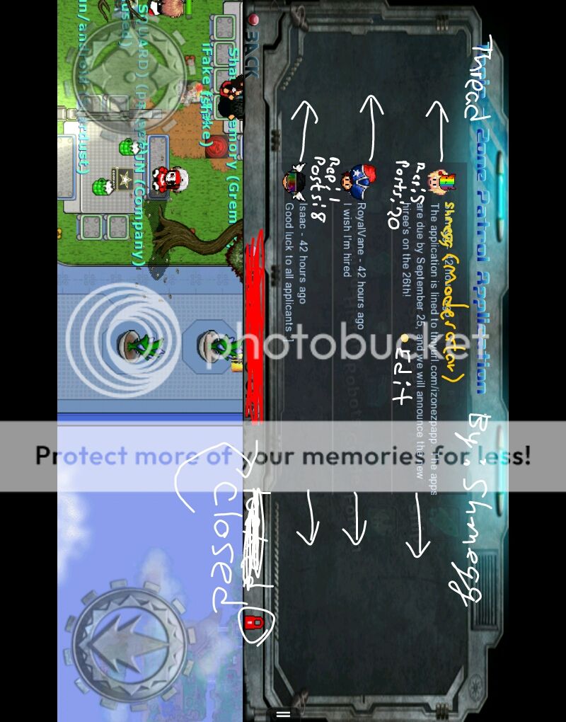
Here I edited the actual Thread Conversations. Underneath the icon would be their amount of posts, and reputation points (Like Graalians), and just added a few word edits. I also made the Moderators (Staff) names gold and with the tag of (Moderator).
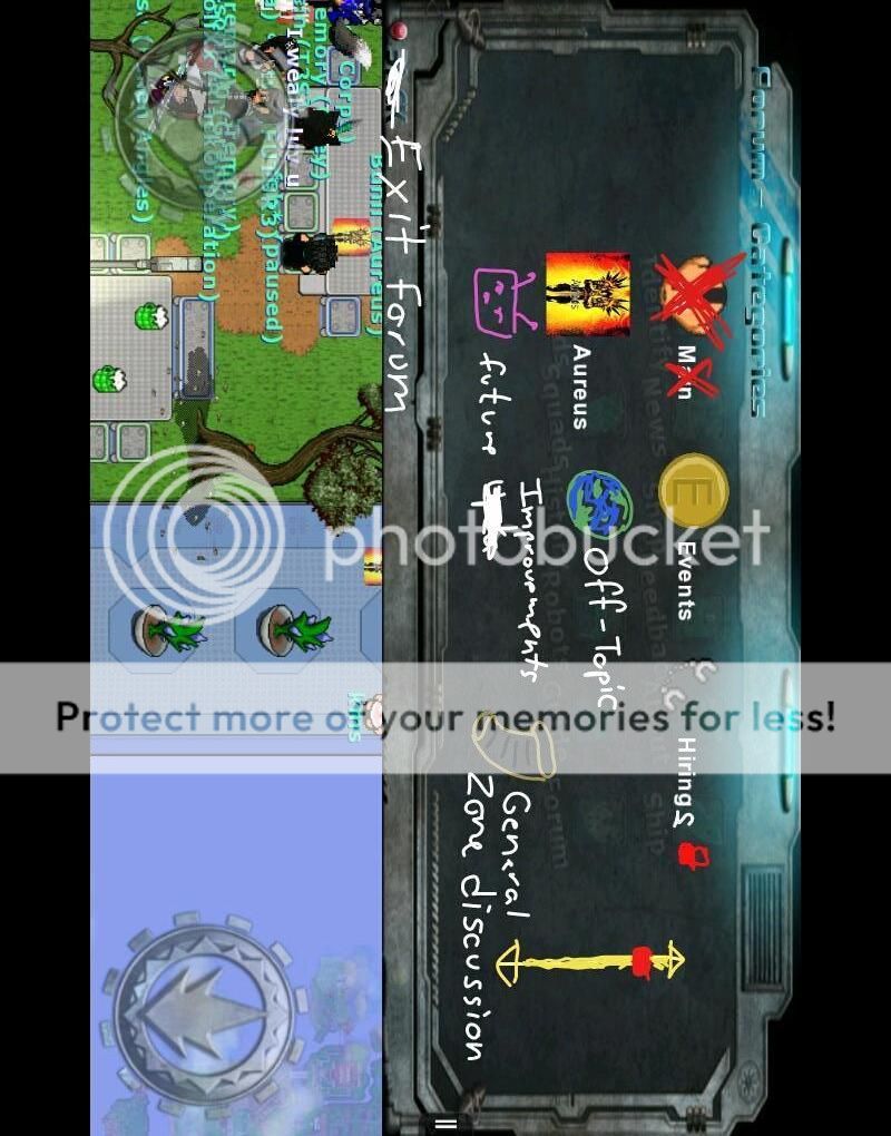
Removed the "Main" section, because I believe it's too vague, making the threads random. Added sections for Off-Topic Chat, General Zone Discussion, and Future Improvements. Also added a scroller for easier scrolling, and removal of accidental pressings.
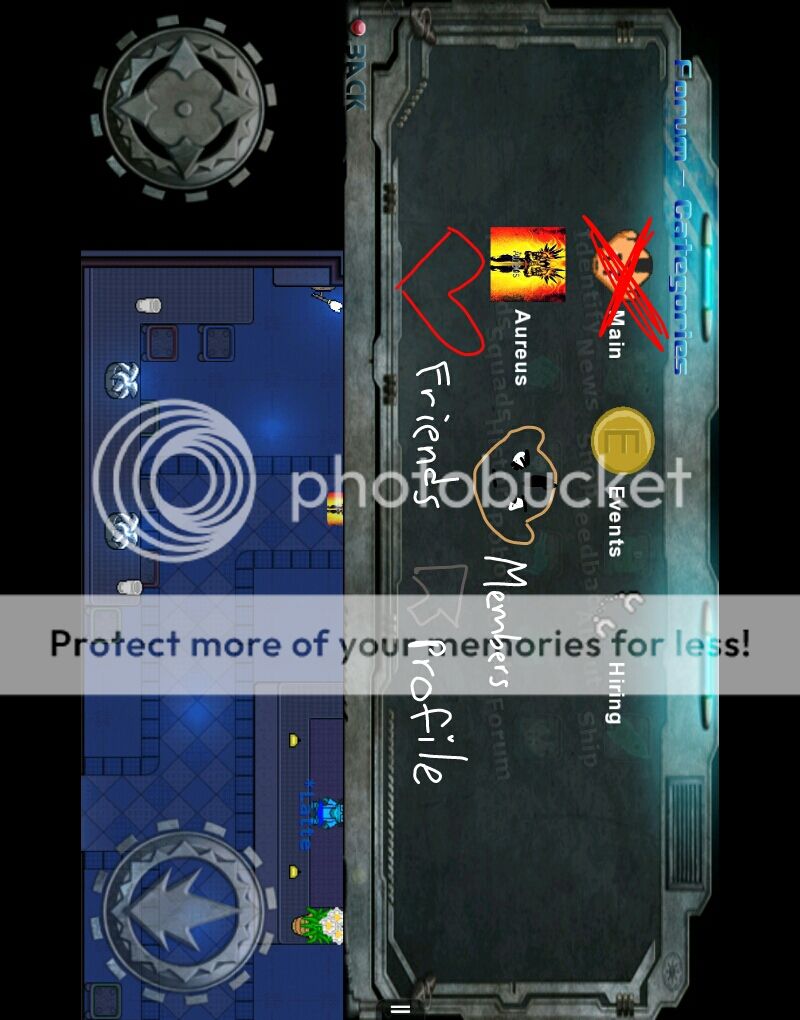
Added more sections: Members, Friends, and Forum Profile.
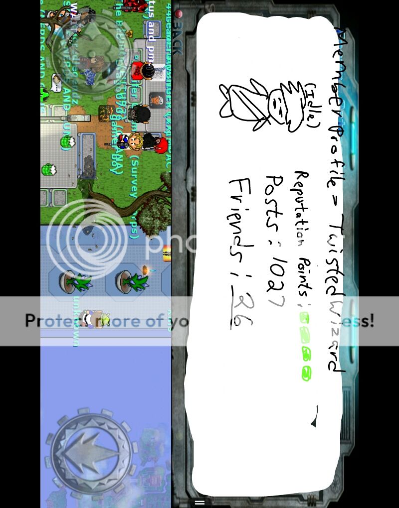
Here's an example of what a Profile would look like if you pressed the particular Member, or Profile button. Friends are underlined so you can press on that, and see their friends.
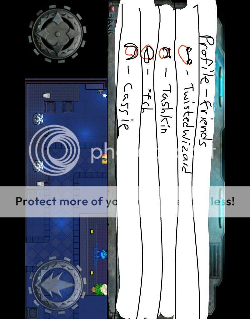
Here's what it would look like if you pressed members, and or Friends section. You tap their profile head to see their Forum Account Info.